How to create an HTML5 dialog and modal?

In this post we will go through a simple process of creating a pure HTML5 modal, using dialog elements. There is no need to use any frontend libraries or frameworks anymore, we can accomplish this with pure HTML, vanilla JS, and CSS. Let’s dive right in!
Introduction
HTML5 dialog element was introduced back in 2014 but not all browsers were supporting it until now. We can use it anywhere now. It is and it behaves like a normal HTML element, it has open and closed tags like this <dialog></dialog>.
There is a small difference between a modal and a dialog, that we need to discuss. Modal is an element that should cover the entire screen and take all the user’s attention while the dialog is just a popup that serves some information to the user and you can actually use the page while the dialog is open. When the modal is open you can’t do anything except scroll through the page.
Dialog
Modal
Preview HTML5 Modal
Checkout the preview of the modal that you will be building
Creating an HTML5 dialog
To create a simple dialog we can use the following HTML code
<button id="dialogButton">Open a dialog</button>
<dialog id="simple-dialog">
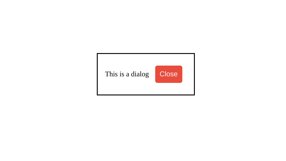
This is a dialog
<button id="dialogClose">Close</button>
</dialog>As you can see we have a button to open the dialog. The dialog itself, and in addition to all that we have a close button to close the dialog. When open it will give us the dialog as shown in the image below.
Now to show the dialog and to close it we are going to write some JS code. What we need is really simple. Two click listeners for two buttons, one for opening and one for closing the dialog.
// Get the dialog element
const simpleDialog = document.querySelector('#simple-dialog');

// Add the click listener for open dialog button
document.querySelector('#dialogButton').addEventListener('click', () => {
// Show the dialog by simply calling show() method on it
  simpleDialog.show();
});

// Add the click listener for close dialog button
document.querySelector('#dialogClose').addEventListener('click', () => {
// Close the dialog by simply calling close() method on it
  simpleDialog.close();
});That’s all there is to it, guys! If the code above is not familiar please check out my other posts. Like this one!
Creating an HTML5 modal
For modals we would do the exact same thing, just instead of calling the show() method we are going to call a showModal() method. Let’s create the modal with the form inside, something that you would usually do for a client.
The html part will be more or less the same:
<!-- A modal dialog containing a form -->
<dialog id="favDialog">
  <div class="title-row">
    <h1>Choose your favorite hero! </h1>
  </div>
  <form>
      <label>
        Favorite hero:
        <select>
          <option value="default">Choose…</option>
          <option>Iron man</option>
          <option>Black widow</option>
          <option>Spider man</option>
          <option>Bat man</option>
        </select>
      </label>
    <div id="buttons-row">
      <button id="cancelBtn" value="cancel" formmethod="dialog">Cancel</button>
      <button id="confirmBtn" value="default">Confirm</button>
    </div>
  </form>
</dialog>
<p>
  <button id="showModal">Open a modal</button>
</p>
<output></output>Now the JS will be a bit more complicated since we do want to show the selected option.
const showButton = document.querySelector('#showModal');
const favDialog = document.querySelector('#favDialog');
const outputBox = document.querySelector('output');
const selectEl = favDialog.querySelector('select');
const confirmBtn = favDialog.querySelector('#confirmBtn');

showButton.addEventListener('click', () => {
  favDialog.showModal();
});

selectEl.addEventListener('change', (e) => {
  confirmBtn.value = selectEl.value;
});

favDialog.addEventListener('close', (e) => {
  outputBox.value = favDialog.returnValue === 'default' ? 'No return value.' : `ReturnValue: ${favDialog.returnValue}.`;
});

confirmBtn.addEventListener('click', (event) => {
  event.preventDefault();
  favDialog.close(selectEl.value);
});HTML5 Modal Code Break Down
Firstly we get all the elements that we are going to use for this example, secondly, we are creating the click event listener for the showButton, thirdly we will call the showModal to show our modal with the created form. Notice that we are using the showModal() and not the show() method.
In order to save our selected hero we will listen for the change event of the hero select. When the user changes the selection we will add that value to the confirm button.
Next, we are listening for the close event of the whole dialog, in addition to that we are populating the output box with either No return value or Return Value plus the super hero name.
Last but not least, we are using the click event listener on the confirm button to prevent the form from submitting but also to call the close() method on the dialog element passing it the selected superhero value, which will be used as returnValue in the close() method of the dialog.
On the cancel button, we have used the special attribute formmethod="dialog" which will close the dialog and also set the returnValue to ‘cancel’. Which you can also get from the event object if you use the following code:
e.target.returnValueHow to close dialog or modal by clicking on its ::backdrop
What we want to accomplish here is to check if the backdrop element has been clicked. We can do this by using the click event object and the dialog dimensions. So for the left side, we need to check if the click happens on the X axis that’s less than the point on the screen where the modal starts on the left side.
favDialog.addEventListener('click', (e) => {
  const dialogDimensions = favDialog.getBoundingClientRect()
  if (
    e.clientX < dialogDimensions.left ||
    e.clientX > dialogDimensions.right ||
    e.clientY < dialogDimensions.top ||
    e.clientY > dialogDimensions.bottom
  ) {
    favDialog.close(selectEl.value)
  }
});Closing HTML5 Modal – Code BreakDown
We are adding a new click listener to the dialog element since the backdrop is its child element but unfortunately, we can’t target it directly. What we can do we can get the dialog’s bounding rectangle. It will give us its position relative to the viewport. Then we can check whether the user clicked on the backdrop or not. The image below although not 100% accurate, since dimensions will vary from screen to screen explains really well what the clientX or clientY should be in order to close the modal.
Conclusion
It was about time, I am so happy that we can do this since we can do it without adding any extra library. I mean maybe the modals from Bootstrap or Flowbite look better, and if you are already including those in your project you can obviously use theirs. But for some projects where you are not using any library, this is really great!


